Tropical Temptation’s Cover Art Evolution
It’s that time again— time to show you guys how my latest cover art came to be. I hope by now you see that my covers take many shapes before Cindy and I agree on a final concept. Here’s a look at Tropical Temptation’s cover art!

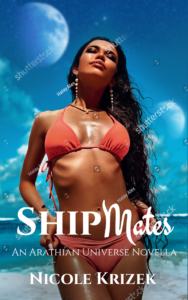
This was the first image Cindy sent me. I liked the overall feel of the image, the contrasting yellow and blue, but I thought that it lacked a mid-ground. (I hope it’s obvious that she was using Shipmates’ title to give me an idea of placement and font.)
I went online to our go-to stock image sites (Shutterstock, 123RF, and iStock), and sent her a few images of beaches with palm trees and surf. The problem was that the model didn’t fit any of those backgrounds. The perspective was off, the lighting was wrong… there were a lot of reasons.

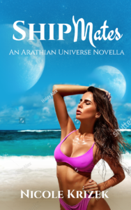

These are the next round of images that she sent me. It took me several days to write a reply… mainly because I was unsure about putting a half-naked woman on the cover of my book. Granted, I’ve used plenty half-naked men on my covers, but some of these images felt like the models were being too sexualized.
This was a conversation that Cindy and I have had before- I’m not a proponent of putting a lone man, bare chested (especially if you can’t see his face) on my cover. I know that other authors don’t have a problem with this, but to me, it feels like I’m sexualizing him in a way that I’m uncomfortable with. So… I scrapped images 2, 3, & 4. I DID like image #1; the way it showcased the curve of her body felt more like art than Sports Illustrated Swimsuit Edition.
I thought Cindy and I had settled on this cover… until she read the manuscript and pointed out one very important fact: Tropical Temptation is mostly set in the jungle, not on the beach.
She was totally right. Why didn’t I think of that fact sooner?! I was so focused on making sure TT’s cover complimented Shipmates’s, that I missed that fact.
It wasn’t back to the drawing board completely, but we switched our image-hunting to something more suitable. These are the next images she sent me:

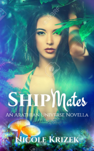


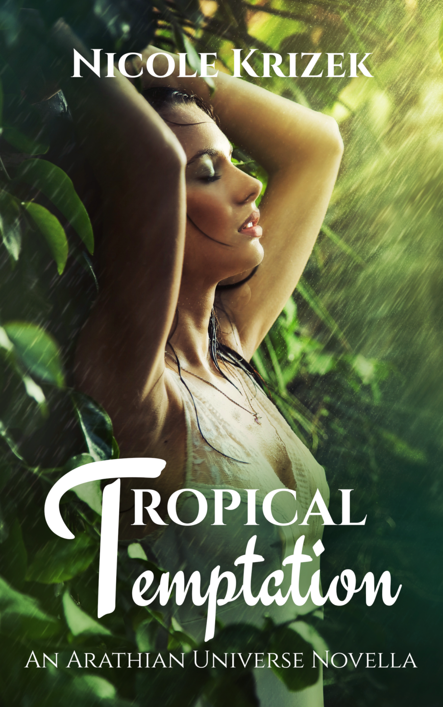
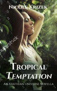
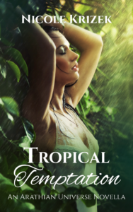
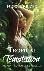
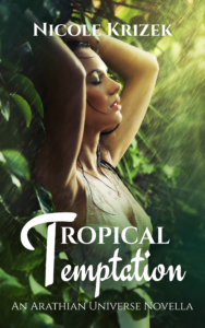
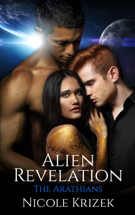
I liked the vibrant colors in the first one, and the model in the 5th (the other model was beautiful, but way too tall for my main character), but it was the last one that I kept coming back to over and over. There’s an intimate scene between the three main characters that takes place in the jungle, and this image was perfect! It was the least colorful of the options she sent me, but no-less captivating, in my opinion.
Right about the same time she sent me these images and I decided on #6, we settled on a name, so Cindy sent me these font treatments (and several others to choose from). I chose the last one, and was TT’s cover was DONE!
Comments (0)