Alien Revelation’s Cover Art Evolution
Cindy and I began designing Alien Revelation’s cover art last September. Whew! I’d forgotten it was that long ago! We knew that we wanted all three main characters on the cover, but arrangement was key. In an email Cindy sent me, she told me, “I’ve made up over 20 covers, but only one of them I like enough to send you.”
Just so you guys can see what she trashed, here are a couple of concepts that weren’t up to her standards. Most were rejected because of placement, lighting, and incorrect models.


This was the one option she liked and sent me: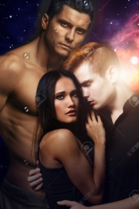
There was a LOT I liked about this image! But then she sent me this:

I liked it even more! Brogan had his hand on Onalee, and I felt like they were all connected to one another. He didn’t feel like a third wheel, which is one of our most difficult challenges in designing a cover with three people.
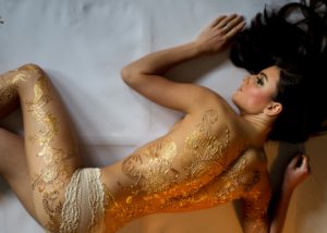
Here are the raw images that we bought:


Isn’t it awesome how she turns these images into my cover?! I wish I had that talent!
As you can see from above, Cindy had also been working on the oriaglyphs on Onalee’s arm, and I was loving the results.
Oriaglyphs: beautiful pains in the ass
Onalee comes from a prominent, influential (and rich) Arathian family. Of course she was going to have oriaglyphs! For those of you who don’t know, glyphs are golden tattoos that Arathian females are gifted with, first when they turn 16 years old, then again at 21. They are very expensive! So only the most wealthy families can afford them.
 Princess Jayda was the only other character I’d written with oriaglyphs, and her cover had been a huge challenge! This is the model I ended up using for Alien Incursion’s cover. My husband (who was making my covers for me at the time) had the difficult job of extending the golden henna in the photo, down the model’s arms and onto her hands.
Cindy knew that she was in for a challenge, but she was excited to try making Onalee’s oriaglyphs herself. I think they turned out beautifully! They’re feminine, elegant, and exactly as I pictured them!
Where to go from here?
I asked Cindy to make Brogan’s skin less red and reduce Onalee’s eye makeup, and this is what I got back:

 <== I liked Brogan’s new coloring, but didn’t like Onalee’s. It felt like her skin had lost much of its luminescence.
This was the next stage. ==> The skin was great, but her oriaglyphs had turned a strange shade of olive green, instead of the gold they’re supposed to be. In the final art, Cindy was able to perfectly lighten their color.
Font options came next, as did background images.
Backgrounds are extremely important! The lighting has to fit with the models, the colors can’t be too overpowering, but not too boring or muddy… plus, I wanted people to be able to tell with a look that this was set in space. These were the options we considered:


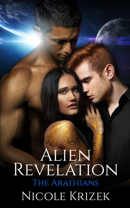
Here’s the final image: 
I love how AR’s cover turned out! The models match my characters’ descriptions, Onalee’s oriaglyphs are perfect, the font and background work well together… I’m incredibly pleased!
Let me know what you all think of AR’s cover! Also, sign up for my newsletter to get exclusive bonus content after AR’s release, and to stay up to date on all of my upcoming news. It’s going to be a BIG year, and I’d hate for anyone to miss it!
Comments (0)