Designing Unearthed’s Cover
Cover design is a process… sometimes a long process! Choosing the correct background, models, and font, then actually having the talent to make the idea come to life… it’s intense.
Today I’m going to do something I’ve never done before- I’m going to give you insight into how one of my book covers came to be.
Let me gently remind you, that all of these covers were rough examples that my graphic artist, Cindy, sent me. They’re in NO WAY finished products- they were put together to give me an idea of “what could be.” So, as long as you all keep an open mind… here we go!
For Unearthed’s cover, I started out with a general concept:
I knew I needed one man, and one woman, in some sort of embrace. I needed to find models that Cindy could Photoshop (without making her pull her hair out!). I needed a background that emphasized “Earth”, and I needed it all to somehow come together!
I started by searching my favorite stock image websites. This involves me sitting in front of a computer for HOURS, usually looking at half-naked men. My girls used to ask me why I was searching through page after page of shirtless males… now they don’t. (I’m not sure if that’s a good or bad thing!)
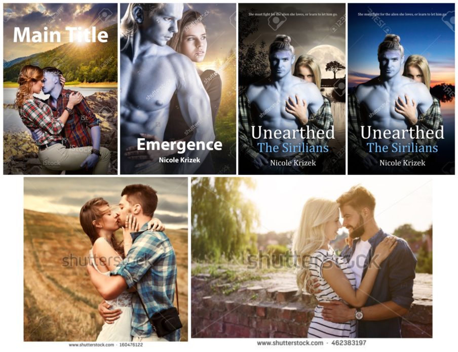
These were the first models I found:
<– was fine…
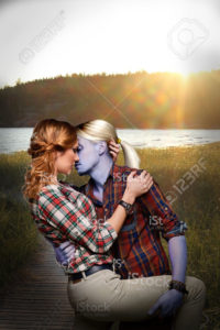
–> I liked this one because she was already blonde, and I liked the sun-lit background, but he had a lot of facial hair to remove.
<– I liked his plaid but that was about it. I guess I also liked the lighting.
–> This was my favorite out of these. I liked their plaid (although I was going to have Cindy turn his shirt into a solid color), he didn’t have too much facial hair to remove, and I liked their position.
Another reason I liked these models, is that they’re clothed. Let me tell you, marketing a book cover on Facebook, etc. that has any kind of nudity is REALLY difficult! I was looking forward to not having that problem with these two, so they’re the ones I decided on.
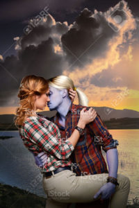
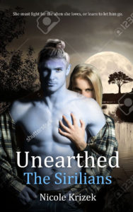
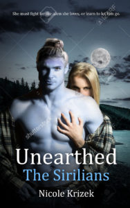
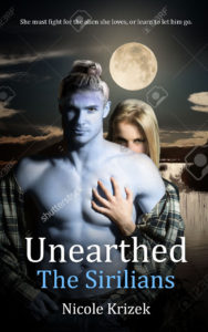
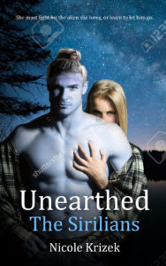
The next step was the background! Here are examples of ones we considered:
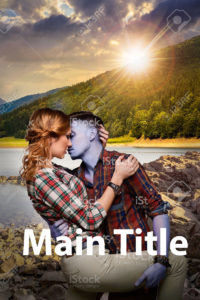
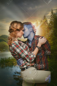
As you can see, Cindy quickly gave him blue skin, Photoshopped in his left arm, and added them onto backgrounds so that I could see how they’d look. In the next stage, she gave him white hair and even more background choices:
Let me say this: we both HATED the white hair! It’s incredibly feminine, and Reus never wears his in a pony tail. By this point, both of us weren’t too excited about any of the options. We each took a week-long break to come up with something new.
<— Cindy emailed me these.
And I sent her these. –>
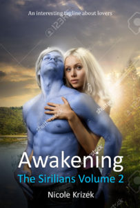
I loved that she was thinking outside of the box and using new people, but I honestly didn’t like either set of models. She liked the new models I’d found, so she gave Reus his blue skin, a quick man-bun, made the mock-ups below (we’d also chosen a title by this time).
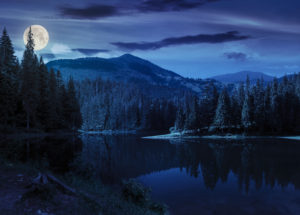
There were lots of reasons I liked/didn’t like these backgrounds. I wanted the background to be a lake with trees. Some of these had too much blue, which would have competed with his skin. One tree looked like something on the savanna, and two of the lakes made me think of a swamp.
I asked her to use the background I’d found and she created this:
 I knew right away that I loved it! There was some polishing that had to be done, but the concept was solid!
From this step to the final version, Cindy: made his blue skin more saturated, removed his facial hair, gave his lips a red tint, turned his eyes blue, gave him proper hair, removed his chest hair, softened Ashlyn’s hair, removed the model’s dark eye liner, removed her nail polish, darkened her bare leg to hide it in the shadows, and changed her eye color. I’m sure she did MUCH more behind the scenes magic than what I just listed!
Here’s the final product for reference:
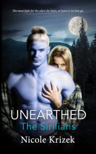
I hope this gives you some insight into the crazy road Unearthed’s cover took. I definitely learned that although I may have a concept in mind, seeing it put together is not always the right choice. I’m SO glad that we kept searching for our models and background! I LOVE the way it turned out!







Comments (0)